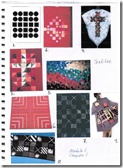
Research and gathering of visual information on Crosses.

1. Grouping similar shapes makes us see a cross in the center.
2. A cut out from “Red Altar Frontal and Causuble. Designed by Queen Margarete II
for Harderslev Cathedral. South Jutland. Danmark.
3. A pieced cross on front of a Chasuble. Designed by Queen Margerete II of Denmark 1987.
4. Log Cabin Chasuble made by Tove Brasse Tuiskoer Federica, Denmark 1987.
5. Antependium. “Christ in You. The hope of glory”. Designed by Barbara Featherstone. England 1988.
6. Madison Square. Carpet designed by Ingrid Dessau. Sweden 1984.
7. Fabricprint. Mini-X. Designad by Sven Fristedt. Sweden 1983.
8. Fabricprint. Satin-cross. Designed by Sven Fristedt. Sweden 1983
9. Ana Hedstrom. Shibori resist dyed. Untitled 1998.

10. Chair. Designed by Björn Alges. Sweden 1982
11. Bookshelf. Designed by Josef Albers 1923. Reproduction 1999 by Rupert Deese.
12. Chair. Designed by Charles Rennie Mackintosh. Glasgow 1904.
13. Lattice work in bamboo intergrated with wistaria creepe. Japan.
14. Menorah with Lollipops and Hands. Designed by Elisabeth Ryland Mears. 1994
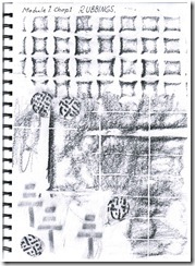
Line drawings and rubbings


Rubbings from wall tiles, floor tiles, box lid and stamps.
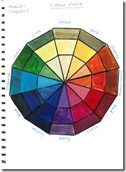
Colour circles.
Colour circle painted with Brusho.
I like the Brusho watercolour as it gives such a intense effect. Looking at the finished circle
I thought that especially the inner circle had too strong colours which could not be called pastels.
Those picture looks like a mess. To late I realized that those scrap papers should be sen tin to the blog. The reason why they look so messy is because I painted over the colour spots with acrylic wax in order to experiment and see if the papers chould be to any use further on. Not very successful though!

This colour circle is painted with Caran D´ache Supracolor Soft. Aquarelle pencils.
I think this one shows the colours much better than the circle in Fig. 5. Here
it is possible to see the pastels in the middle.

To test how the colours looked when painted over them with water, I decided to keep the
colours in Colour circle 2 as they where and not adding water.


Inga kommentarer:
Skicka en kommentar