I am not sure if this is the way to translate the layered designs into embroidery. I am very dissatisfied with the result. Fig.1. perhaps fairly ok.
I am not sure if this is the way to translate the layered designs into embroidery. I am very dissatisfied with the result. Fig.1. perhaps fairly ok.
I have spent seven weeks in Greece. We left Sweden aug. 31 by car and left Greece oct. 19. As we where going by car I had the opportunity to take lots of fabrics, threads etc with me, but forgot to bring a sewinghoop!! A hoop I needed in order to go on with Module 1, Chapter 7 at the Distant Stitch Course.
Missing a hoop I had to do something else, so I made some small works.
This collage is made of Lutradur as a background stabilazer and then bits of fabrics such as solids and sheers backed with Bondaweb/Vliesofix where then ironed on the Lutradur.

This is a wholecloth I have painted with transfer dyes and then embroidered with different kind of stitches and threads.
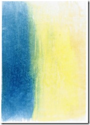
The wholecloth looked something like this before I started to embroider (it should be rotaded to the right, but I do not know how to!)
This is my inspiration for the embroidered landscape. I have changed the olive trees to a flower meadow instead.
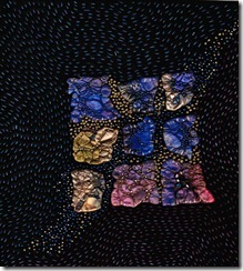
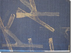
Painted Tyveck cut into pieces and attatched with gold thread to black felt. Seed beads added and running stitch with different threads are filling the background.

Another variation of painted Tyveck on black felt.
Here I have choosen one of my “cut and fold” designs and translated them into fabric using “Bondaweb” (Vliesofix)

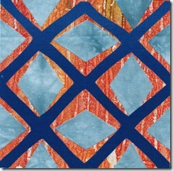

TO MAKE A DECORATIVE BONDED FABRIC WITH BITS


Positive image

The selected fabrics were damask, silk, cotton, cotton satin and organza, which gave a varity of different surfaces such as shimmery, matt, soft and textured.

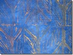
Even if this, the above, is not well designed, I think this way of overlaying could be a way to achieve some interesting pattern.
Paints used were Golden fluid acrylics:
- Iridescent Copper Light
- Iridescent Bright Gold (fine)
- Interference Oxide Red
Some of the stamps used: Rubber stamps (1), foam stamps (2) and expanding sponge stamps (3).
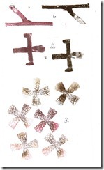
I think the expanding sponge stamp makes a very interesting, textured pattern.
CUT AND FOLD DESIGN SHAPES in black paper
Above are some exaples of cut and fold shapes from black paper most of them symmetrical and some asymmetrical.
Crosses used are the George´s cross and the Cross Crosslet. Next to every cross is a sketch of the design before it was cut out. Some cut symmetrical, others asymmetrical.
CUT AND FOLD DESIGN in coloured papers.
The Georg Cross and the Latin cross are used in the abowe symmetrical designs.
Of the abowe folded and cut out designs I prefer 4A.
Abowe: Asymmetry - Layers of asymmetrically cut papershapes.
I think C is a good design, even if the blue colour is a little bit too dark.
Abowe: Asymmetry – Layers of symmetrically cut papershapes.
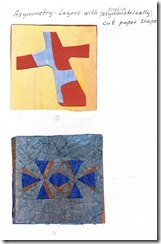 Picture G & H
 Picture I
 Abowe: Asymmetry – Layers with negative cut paper shapes.
This chapter is about playing with cross shapes in order to see how many ways in witch it is possible to transform it. This design exercises is ment to give a structure of how to play with a shape and developing it by beeing inventive and creative.
Before starting to work on Design Sheet A, I wanted just to test how positive and negative shapes looked like, using some different cross shapes.
Half fork cross, fork cross, arrow cross and tilted Andrea cross.

DESIGN SHEET A:1

The George cross is the highest civilian reward in Great Britain and painted red it is used by the Masonic order.
Cross Crosslet is a symbol for world evangelism. Four Latin crosses meet at the center, and each cross represents a point on a compass – symbolizing how the christian faith should spred on earth in all four directions. Cross Crosslett is one of two variations of the general form of the Jerusalem cross. The second version is St. Julian´s cross with the four Latin crosses set diagonally.
To start with I had some difficulties to choose which cross to work with, so I started with George´s cross and Cross Crosslet.
i Counterchange
ii 4 positive and negative cross shapes in a square, touching each other, so that a new shape is
formed by the enclosure.
iii Symmetrical formed cross.
iv Asymmetrical formed cross.
DESIGN SHEET A:2

Here I have used the Cross Crosslet and I think the – perspective distortion and also the repeated pattern with the redesigned cross in the triangle, turned out well.
v Perspective distortion
vi Redesigned Cross Crosslet in a diamond, circle, and triangle.
vii The redesigned cross in the triangle, has been used to make a repeted pattern where the
shapes link together, edge to edge.
DESIGN SHEET B:1

i A small positive shape and a large negative shape of the Cross Crosslet.
ii A simple repeated pattern using the two sizes of the cross shape.
iii A simple border and corner using the cross shape.
iv A linking border consisting of two interlinked cross shapes.
v Two different crosses are interlinked in two different ways.
DESIGN SHEET B:2
vi The uppermost shapes is made using 4 Cross Crosslet patterns. Those were glued asymmetrically on an orange paper square. A tilted cross was after that cut out. The leftovers are glued back with a distance from the cross shape - just in order to see how the piece loooked before it was cut apart. Perhaps not a good idea, as it is a bit hard to see the cross shape.
Bottom shape: 4 “legs” of the Cross Crosslet were glued diagonally to a blue paper and then a George´s cross is cut out, giving a symmetrical shape. The glued leftoveres are not so disturbing here, probably as it is symmetrical design.
DESIGN SHEET C
i The George´s cross is cut into quarters. Alternate colours are used in opposite spaces.
Looking at the two crosses the alternate colours in opposite spaces are not so easy to
distinguish.
ii A new design variation using one of the parts of the unit.
iii Overlapped units. A border design.
iv New motif in repeat.
Those designs work well, I think.
v Simple symmetrical repeat unit.
vi Interlaced asymetrical repeat unit.
Perhaps not so successful designs.